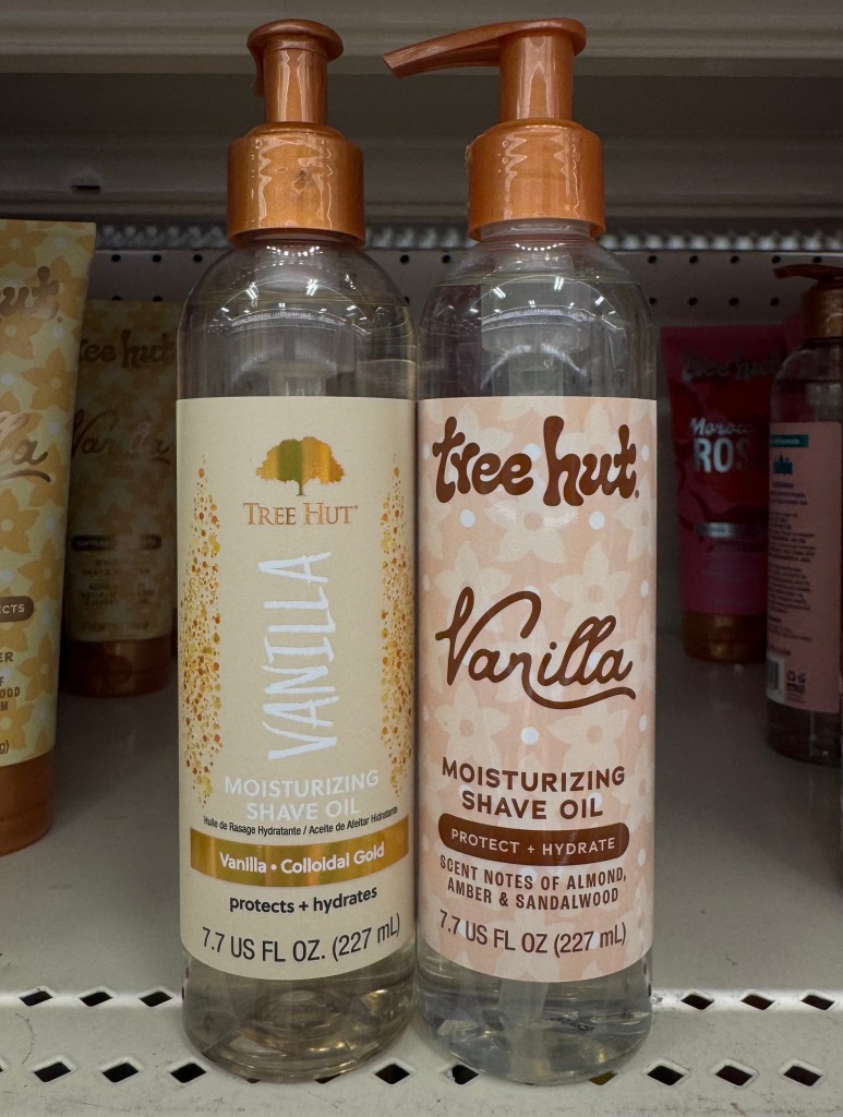
As a consumer with a marketing eye, paying attention to product packaging rebrands and how brands choose to reposition themselves in a market is one of my favorite things to watch out for. For years, Tree Hut has been a recognizable name in the body care aisle, particularly known for its popular sugar scrubs and being the staple for the “everything shower.” But while their products have maintained a loyal following since their launch in 2002, the brand’s visual identity began to feel outdated compared to newer competitors in the industry. The older packaging appealed more to an older demographic which lacked the playful, eye-catching aesthetic that many body care brands use to stand out on shelves and on social media. Since customers are increasingly drawn to visually appealing brands, Tree Hut’s inconsistent and somewhat boring packaging made it easy to overlook despite the quality of the product inside. Tree Hut was stuck in the early 2000s and at the end of the day, when a brand’s packaging is often the first impression it makes on a customer, it needs to create an immediate response that draws them in. With Tree Hut’s older packaging, that instant appeal wasn’t always there, which left customer loyalty to the product itself as the only thing leading to their success, something that isn’t sustainable long-term.
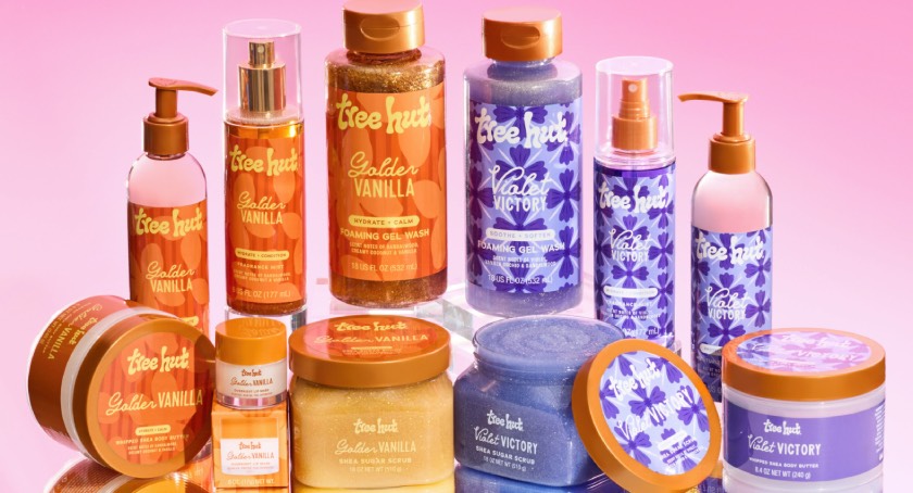
At the end of 2025, Tree Hut rolled out a noticeable rebrand, “Uncontain Yourself,” that introduced brighter colors, sleeker packaging, and a more cohesive design across their product lineup that they called their own “glow-up,” to celebrate joy and self-expression. The new packaging embraces a funky, groovy aesthetic that is more aligned with current beauty trends and instantly grabs consumers’ attention in the body care aisle. While many consumers, like me, appreciate the fresh updated look, some have criticized the rebrand stating the packaging appears “childish” and even “cheap” compared to their previous packaging. But despite some mixed reactions, I think the rebrand has undeniably made Tree Hut more visually distinct and recognizable in a crowded and highly competitive market (the main point of a rebrand).
Tree Hut’s total redesign highlights an important marketing lesson of rebranding: that sometimes a brand doesn’t need to reinvent its product, but instead change how that product is being presented to consumers. A strong visual identity can help brands reconnect with existing customers while also attracting a new generation of buyers who prioritize aesthetics and brand personalities. Like I said in my blog, In the Details: What Consumers Miss, “consumers may notice the aesthetics, but completely miss the intention.” Brands aren’t just rebranding because they can, it’s an intentional and strategic decision, and one that comes with risk as success is ultimately left to consumers the moment the product hits the shelf. When executed well, rebranding can shift perception, increase visibility, and give a brand a second life in an extremely evolving market, and in my opinion, Tree Hut did just that!
What do you think about Tree Hut’s rebrand? Does the new packaging make you more or less likely to pick it up off the shelf?


Leave a reply to Jay Schmitt Cancel reply